SwiftUI offers a variety of semantic colors that adapt to different contexts and system settings,…
Gauge in SwiftUI – Linear and Circular Gauge
Gauges are perfect for visually representing data like progress, metrics, or any measurable parameter within a bounded range. In this tutorial, we’ll explore how to implement both linear and circular gauges.
Implementing Linear Gauge View
Create a new SwiftUI view named LinearGaugeView. This view will focus on using a linear gauge to represent a value like heart rate.
import SwiftUI

struct LinearGaugeView: View {
    @State private var currentHeartRate = 75.0
    let minHeartRate = 50.0
    let maxHeartRate = 180.0

    var body: some View {
        VStack {
            Text("Heart Rate Monitor - Linear").font(.title).padding()

            Gauge(value: currentHeartRate, in: minHeartRate...maxHeartRate) {
                Text("BPM")
            }
            currentValueLabel: {
                Text("\(Int(currentHeartRate))")
            }
            minimumValueLabel: {
                Text("\(Int(minHeartRate)) BPM")
            }
            maximumValueLabel: {
                Text("\(Int(maxHeartRate)) BPM")
            }
            .gaugeStyle(.linearCapacity)

            Spacer()
        }
        .padding()
        .onAppear {
            simulateHeartRateChange()
        }
    }

    private func simulateHeartRateChange() {
        Timer.scheduledTimer(withTimeInterval: 1.0, repeats: true) { timer in
            self.currentHeartRate = Double.random(in: minHeartRate...maxHeartRate)
            if currentHeartRate >= maxHeartRate {
                timer.invalidate()
            }
        }
    }
}
In the LinearGaugeView, we utilize a linear gauge to provide a clear and straightforward visualization of data. This example focuses on monitoring heart rate, with the gauge displaying the current heart rate value as a percentage of the total possible range. The linear style is particularly effective for scenarios where users need to see gradual changes or progress over time. It’s akin to a progress bar but with added features like minimum and maximum value labels, making it more informative.
The view starts by displaying a title and then the gauge itself, which is styled linearly. The gauge is bound to a currentHeartRate state variable that updates every second to simulate real-time changes, mimicking how you might track heart rate changes during a workout. This dynamic update is achieved using a repeating timer that randomizes the heart rate value within a predefined range between 50 and 180 beats per minute. The linear gauge displays this value along with labels for the current, minimum, and maximum heart rates.
Implementing Circular Gauge View
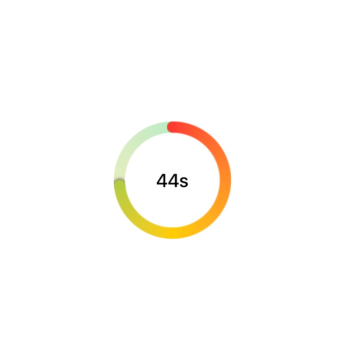
Create another SwiftUI view namedCircularCountdownTimerView that will present a circular gauge to visualize a countdown timer, counting from 60 seconds to 0.
In this example, the countdown starts as soon as the view appears. The gauge visually represents the remaining time, updating every second. This style of gauge is particularly suited to applications where timing is crucial, and users need a quick, at-a-glance understanding of the time left.
import SwiftUI

struct CircularGaugeView: View {
    @State private var currentHeartRate = 75.0
    let minHeartRate = 50.0
    let maxHeartRate = 180.0
    let heartRateGradient = Gradient(colors: [.green, .yellow, .red])

    var body: some View {
        VStack {
            Text("Heart Rate Monitor - Circular").font(.title).padding()

            Gauge(value: currentHeartRate, in: minHeartRate...maxHeartRate) {
                Image(systemName: "heart.fill").foregroundColor(.red)
            }
            currentValueLabel: {
                Text("\(Int(currentHeartRate))")
            }
            minimumValueLabel: {
                Text("\(Int(minHeartRate))")
            }
            maximumValueLabel: {
                Text("\(Int(maxHeartRate))")
            }
            .gaugeStyle(CircularGaugeStyle(tint: heartRateGradient))

            Spacer()
        }
        .padding()
        .onAppear {
            simulateHeartRateChange()
        }
    }

    private func simulateHeartRateChange() {
        Timer.scheduledTimer(withTimeInterval: 1.0, repeats: true) { timer in
            self.currentHeartRate = Double.random(in: minHeartRate...maxHeartRate)
            if currentHeartRate >= maxHeartRate {
                timer.invalidate()
            }
        }
    }
}
The CircularGaugeView demonstrates the use of a circular gauge, which wraps the data visualization around a circle, making it compact and visually engaging. This style is suitable for applications where space is limited or when you want to present data in a way that is visually distinct from traditional linear progress indicators.
In this example, the circular gauge monitors the same heart rate data as the linear gauge but presents it in a circular format. The gauge is colored with a gradient that transitions from green to red, symbolically indicating the transition from a normal to a high heart rate, which can help in quickly assessing the health data at a glance. Just like in the linear example, the gauge’s value updates every second to reflect changes in the heart rate, which could be connected to real sensor data in a practical application.
This view also starts with a title and includes the same dynamic data updating logic as the linear gauge, using a timer to simulate heart rate changes. The circular style is enhanced with a gradient tint, adding a visual depth that can be aesthetically pleasing and functionally useful in quickly conveying the seriousness of the readings (e.g., a red color indicating a high heart rate).
To change the size of text or a gauge you can apply .scaleEffect() modifier.
Conclusion: When to Use Linear vs. Circular Gauges in SwiftUI
In SwiftUI, choosing between linear and circular gauges depends on the specific needs of your application, the data being represented, and how you want users to interact with that data. Each gauge style offers unique visual and interactive characteristics suited to different use cases:
Linear Gauges
Use Cases:
- Progress Tracking: Linear gauges are ideal for scenarios where progress needs to be tracked over time, such as file uploads, course completions, or achievement progress in games.
- Capacity Measurements: They work well in situations where you need to represent capacities, like battery life, storage space, or any meter that fills up.
- Settings Adjustments: Linear gauges can be effectively used in settings where precise adjustments are necessary, such as volume control or brightness settings.
Advantages:
- Linear gauges provide a clear beginning and end point, which can be intuitive for users as they represent progression in a straightforward, directional manner.
- They are easy to fit into UI layouts, especially in forms and lists, where horizontal or vertical space is aligned with other UI elements.
Circular Gauges
Use Cases:
- Time Remaining: Circular gauges are particularly useful for countdown timers or any time-bound event where the gauge can represent the passage of time in a cycle, such as in the example provided.
- Performance Metrics: They are suitable for displaying metrics like speedometers or tachometers, where a circular dial helps illustrate the concept of reaching a maximum limit.
- Health and Fitness: Circular gauges are often used in health and fitness apps to show heart rate, daily activity completion, or nutritional goals, providing a quick snapshot of achievement or status.
Advantages:
- Circular gauges make efficient use of space and are visually engaging, often used in dashboards and control panels where aesthetic appeal and quick data visualization are crucial.
- They can symbolize cycles and repetition effectively, which is particularly useful for time-related data or any metric that operates within a bounded circular range.
Choosing the Right Gauge
When deciding which gauge to use:
- Consider the nature of the data and how it’s best understood—is it ongoing or cyclical?
- Think about the user interface and where the gauge will be placed. Does the layout favor a more elongated or a more compact gauge?
- Reflect on the user experience: How will the gauge help the user better interact with the app? Is it for passive monitoring or active interaction?
Both gauge styles offer robust options for customization and styling, ensuring that they can be seamlessly integrated into your app’s design language while enhancing functionality and user engagement. Selecting the right gauge style can elevate the overall user experience, making your app not only functional but also intuitive and aesthetically pleasing.
Related Posts